

Painting for a Mid-Century Modern look is easy AND difficult. It’s easy, because in Mid-Century Modern decorating, furniture and architecture make stronger statements than heavily painted or wall-papered walls. In fact, a minimalist white best compliments true Danish Modern furnishings. But painting for a Mid-Century ambiance is also difficult, because selecting even a simple white wall paint can be tedious and taxing. I love decorating, but I have learned to depend on a trusted decorator for help with paint selections! Here are some painting tips I’ve gathered.
Now that I’ve installed beautiful new flooring in the condo I’m renovating, it’s time to tackle the walls. What I’ve learned regarding the use of paint color in Mid-Century Modern decor can be summed up with 3 rules.
- The most beautiful rooms have white walls.
- Color is used in occasional bursts (think accent walls and furniture).
- When color is used, it is usually a vibrant, saturated hue.
Rule #1 – white walls
I used to believe that white walls were boring and used only by people with little design acumen. Wrong. When I began collecting photos of stunning Mid-Century Modern rooms that I loved, I noticed a unified trend running through my Pinterest boards. White walls. The rooms were all so restful, so lovely. My eyes were drawn to the clean lines of the furniture and the modern architectural features of the room. Here are some of my favorites.


rule #2 – pops of color
I’ve noticed that many mid-century rooms have either a dramatic accent wall or colorful piece of furniture to give the room more personality.


rule #3 – saturated color
And don’t forget, when color is used, it should be vibrant! Mid-Century Modern is not for cowards.


Now to show you how I’m adapting these tips to my beach condo…
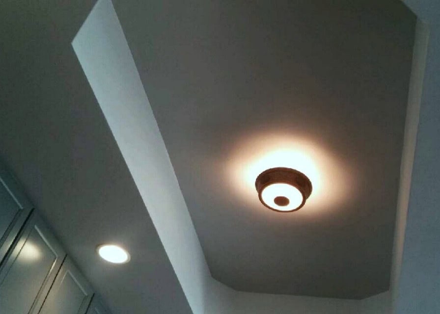
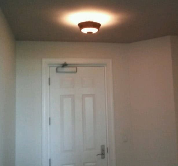
(Keep in mind, my painter sent me these photos from his cell phone, so the quality is not very clear.) I selected a soothing white for the majority of the walls throughout the condo, with a fresh coat of bright white to the doors, baseboards and ceilings. However, I did paint the ceilings in the foyer and main living areas (kitchen, living & dining) a soft gray.

Once I decided on mostly white walls, I did want to bring in a few pops of color. A large wall in the dining area was a natural choice for an accent color, so I went dramatic.

In the kitchen, I painted the cherry cabinets a medium gray, and I plan to install white quartz countertops. To add a hefty punch of color in the kitchen, I stumbled upon a beautiful chartreuse tile from Heath Ceramics for a backsplash. See how the colors work well together!

I also added a very dark color, SW Urbane Bronze, to a small hallway and powder room. I love dramatic colors in small spaces, and this particular color is so intriguing.

So there you have it. The color palette for my beach condo. Pearly White walls, soft gray ceilings, and a few bold accents. You’ll see it all put together soon!

Thanks for sharing this post with us.Medical alarms are designed to work in and across the dwelling. Seniors are essentially the most susceptible when alone within the dwelling, even when they’ve a partner or member of the family within the dwelling that may’t all the time hear their cry for assist.
Good luck with your project! Would love to see pics when you are done!
This is splendid and mind soothing. The way you have submitted the information over is very informative and organised. Couple of days back i was looking for those information but couldn’t found anywhere.After surfing the Internet rapidly i got you but i want more details information regarding this topic! Could you please tell me more! Thanks for your amazing professionalism and great patienc. I am waiting for your reply!
Hi, Wendy, great article! What paint for interior walls could you recommend? Also what primer do you use?
Hi Adam, I always use a latex paint with a satin finish for all my interior walls, as it is easy to wash and keep clean. I don’t have a preference for primer. I only use one if covering dark walls. HOpe this helps.
Great article. Thanks
Glad you enjoyed it!
Wow! Just like your info. My wife wants to rebuild kitchen paint and I wanna make it with my own hand. I think your tips help me to make a beautiful kitchen look.
Good luck with your project! Would love to see pics when you are done!
Hi Wendy,
Great article! Whats the color brand/name and finish on the first photo ” White walls allow you to immidietly…” , please?
Thanks,
Leo
I’m so sorry but I don’t know the exact paint shade. I found that when selecting white for my walls I needed a seasoned decorator’s help, as there are so many shades of white! It is harder selecting the right white than a bold color.
Thanks Wendy for sharing this really innovative way of painting for a trendy look of a house. I also thought that white is boring colour but this really changed my mind.
So glad you stopped by. I know. I feel boring choosing white, but it is actually very soothing and minimalist feeling!